Abstract Color Scheme
The style an artist that develops over time includes all aspects of painting techniques. This is what makes us unique or part of the mass fashion of the time. The contemporary picture we observe most of the time in abstract expressionism limits many of the techniques used in the past.
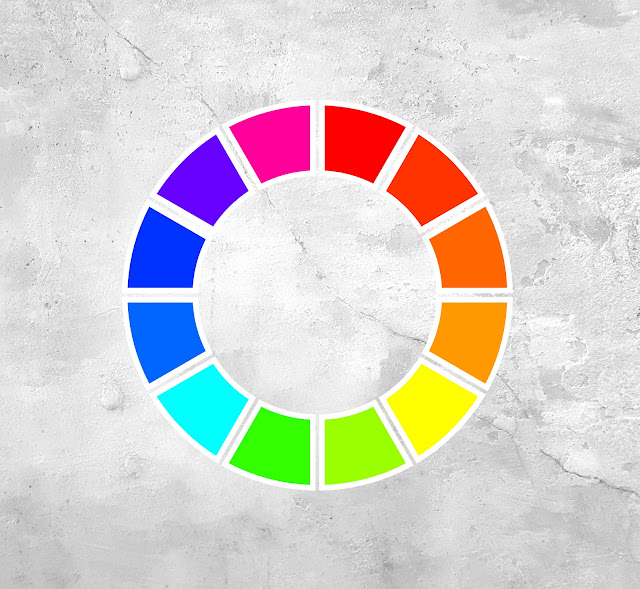
The color palette that Yordan Kondov uses is a modified version of the classic RYB color wheel. It contains the three primary colors (blue, yellow and red). When combined together they produce the secondary set of colors (green, purple and orange) and the tertiary colors occur when we mix secondary and primary colors in different proportions.
It sounds more complicated than it actually is. Here is a good example: yellow and blue are primary colors. When mixed they produce green. Between blue and yellow we have blue green and yellow green. The same scheme is valid for the rest of the secondary colors. In total there are 12 colors in the RYB version of the palette.
The artist uses his own modified version. Instead of all 12 he uses 8 colors. In Yordan's paintings there are 2 primary, 2 secondary, 3 tertiary and 1 quaternary colors. Quaternary means the mixture of equal parts of tertiaries. The painter creates art works that could be divided into eight parts. From left to right there are purple magenta (a tertiary color), primary magenta, orange, yellow, green, blue green and blue.
The artist has chosen to base all his paintings on the RYB (red, yellow, blue) color wheel because it is harmonious. The different parts of his art work look good together and naturally transition within each other. Nevertheless there are exceptions and not all portions could go well together without a few modifications.
Complementary colors (also called opposite) create unpleasant perception for the viewer when they touch each other. Green and red, yellow and purple and blue and orange are the 3 complementary pairs.
They are the worst combinations when they share a physical border. This is the reason why there is a contest for the ugliest Christmas pullover in some parts of the world. They consist mostly of green and red and people have sensed the unease for centuries.
Usually most national flags were designed to avoid the contact between opposite colors. There are exceptions though. The flags of Portugal, Bulgaria and Armenia (there are maybe more examples) include touching complementary colors.
Kondov arranges his 8 colors of choice in equally sized squares and they would
inevitably make the green portion touch the reddish one. To avoid that the artist extends the yellow part and this prevents another possible contact between green and orange. They are secondary colors but still produce unpleasant feelings for the viewer.
When it comes to brush technique Yordan prefers a combination of soft and hard edges so additional colors are needed to achieve this effect. Otherwise the paintings would consist of 8 solid color pieces which obviously is not the case.
The artist mixes a main color and then he derives new tints from it by adding titanium white. This creates 3 values which differentiates the brush strokes. They are more visible and expressive when they consist of high contrast values. Otherwise these brush strokes would be almost lost in the painting.
Adding more and more white creates the different tints of the color. The combination
between them produces a monochromatic picture. To many artists including Yordan it looks boring and lifeless. Kondov overcomes that possibility by mixing more similar colors which vary by saturation and tint.
Many abstract expressionist artists use paint as it is straight from the tube. This approach was first invented in the early 20th century by a few french artists. The most famous of them was Henri Matisse. The movement was called Fauvism. Tham name is derived from the French word for “beast”.
A journalist from that time invented the term to express his resentment to such an approach. Back then the style was considered too rough,wild and different from everything the world of art has seen until that moment.
Nowadays the paintings of Henri Matisse are considered extremely valuable so it is no surprise so many modern painters still use colors as they are straight out of the tube.
Kondov is among the artists who resent such an approach. He considers unmixed colors as too saturated, unnatural, unpleasant and kitschy.
It would be best to describe the artist's style of color mixing by presenting an example. The magenta portion of his paintings starts with primary magenta (PV19). Then he reduces the chroma by adding a little bit of titanium white and chrome - oxide green (a type of phthalocyanine green with pigment code PG17 ). PG17 gives warm colors a colder look without sacrificing much of the saturation.
To that mixture the artist adds titanium white in two separate stages and creates two new tints with higher values. Now we have three values of the same color. To the midtone one Yordan adds more Chrome oxide green to reduce the chroma even further until reaching almost gray nuance.
To the other color the artist adds pyrrole red (PR254) to bring back warmth and to slightly alter the tint. The first one produces a worn-out effect and the second gives richness which the monochromatic palette lacks. The same approach is valid for all the other seven parts of his painting.
Kondov is a non-figurative expressionist artist but prefers the fullness of everyday life colors. Outside is never monochromatic and limited in tints. This is the realism part of Yordan’s abstractions and this approach is a lifelong artistic choice.


Comments
Post a Comment